banking & finance
psst: can you recognize where these lions are from?
hint: no bulls, just as great as before...
hint: no bulls, just as great as before...
Citibank strikes again, this year with their 8pcs maiden set, both Citigold and the mass market edition sets comes in a die-cut red box with wording difference of Citigold and the Citi logo on the front, flaps and boxes. The box features a beautiful circle window that allows us collectors to have a different view in eight different ways! If you are a fan, do hop over to my home page to catch my series of princesses and queens gathered over the years.
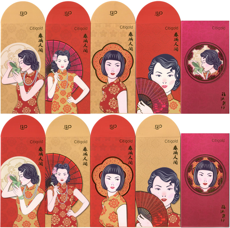
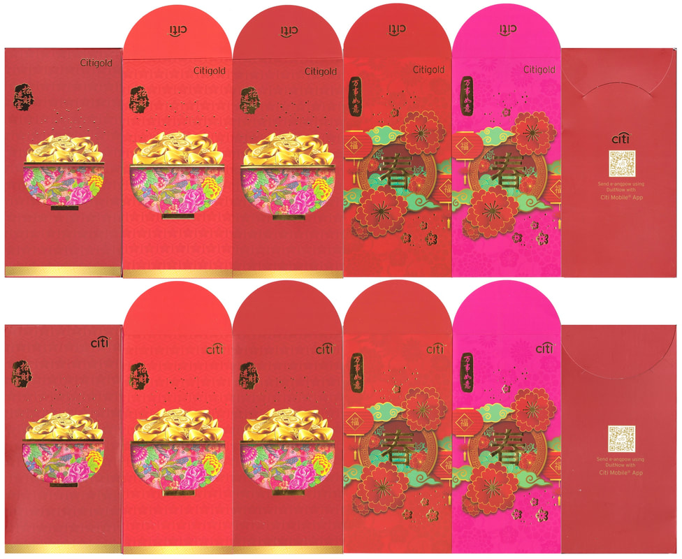
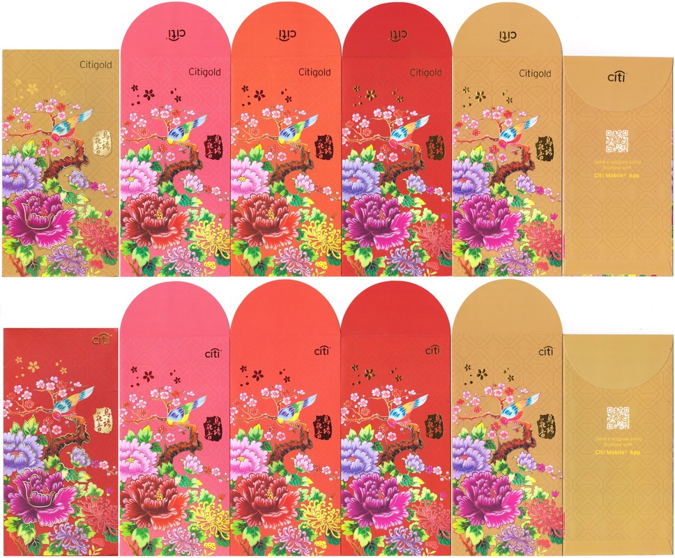
2022 Citibank Citigold
2021 Citibank Citigold
2020 Citibank Citigold
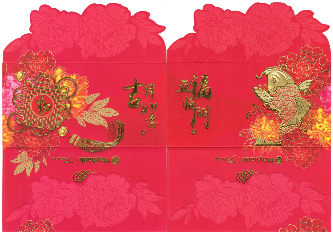
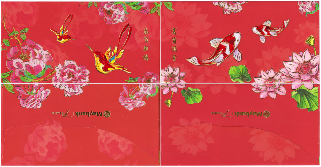
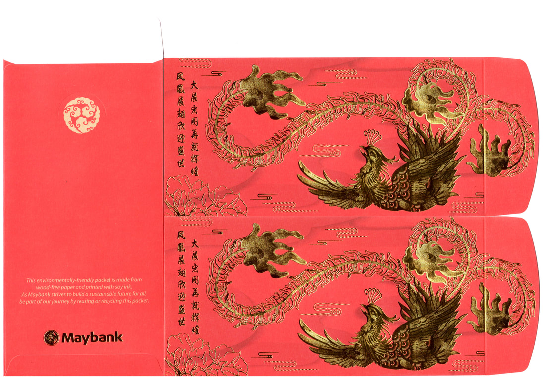
The rise of the golden and silver phoenix! Look at the glitters that Maybank showered us with. Following their Chinese knot and giant Koi last year, this year phoenix took the spot light and once again with a unique flap cutting, love them!! I still love their sweeter 2020 pair, how about you? As for their mass market edition, consistently single but varying flap designs since 2016.
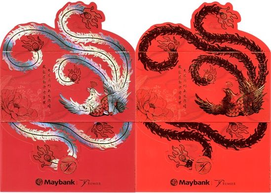
2022 Maybank Premier
2021 Maybank Premier
2020 Maybank Premier
2022 Maybank
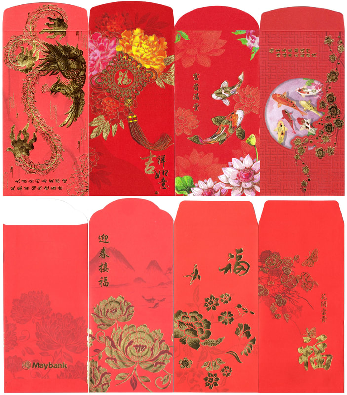
2016-2022 Maybank
OCBC has yet again for another consecutive year brought us collectors a catchy and vibrant design. From last year's meaningful theme of OCBC Cares featuring little houses with floral background to this year's auspicious lions (normal vs premier) formed by joining (top) two pieces for the eyes and (bottom) two pieces for the mouth. The normal set comes in a smaller casing envelope while the premier version with thicker paper quality has a slightly bigger size casing. I would definitely put them on my top three from the banks. What's your verdict?
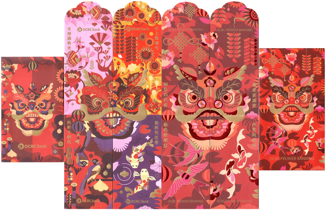
2022 OCBC Mass vs Premier
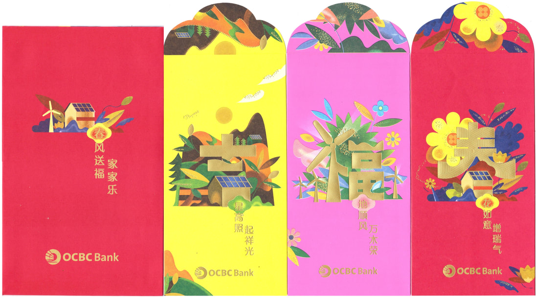
2021 OCBC
|
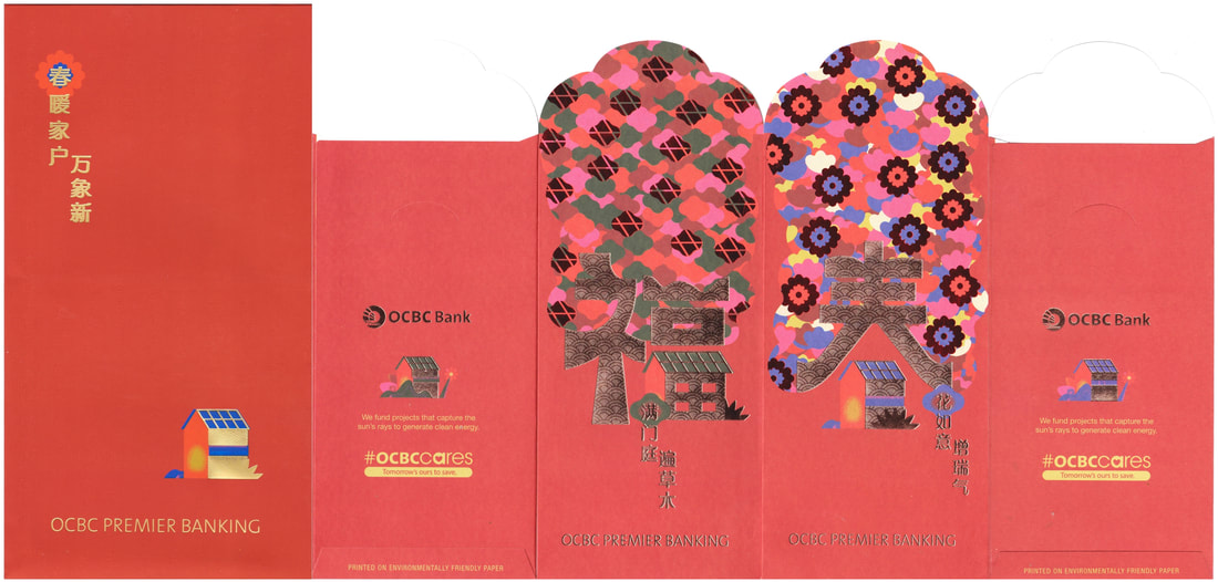
2021 OCBC Premier Banking
|
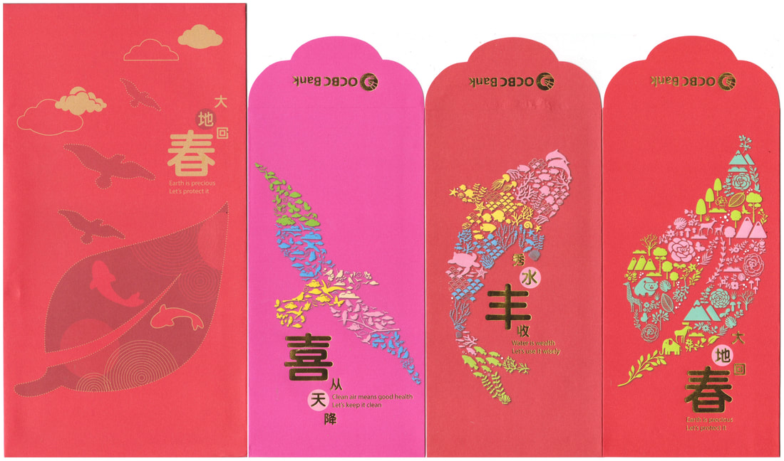
2020 OCBC
|
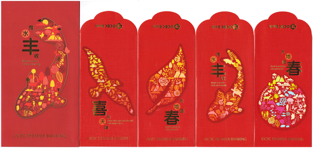
2020 OCBC Premier Banking
|
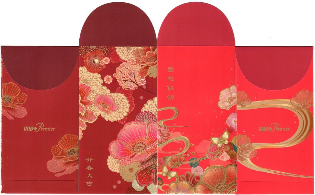
2019 - 2022 RHB Premier (with box)
RHB continued with their premier box set since 2018 which for me was still their best trio since; Thereafter they came in pairs including this year's floral duo which featured a little more colors. Their mass version is only a single piece design, put it together with the rest and we have a family series since 2013. Take a look at their flap designs over the years.
2022 RHB Premier
2021 RHB Premier
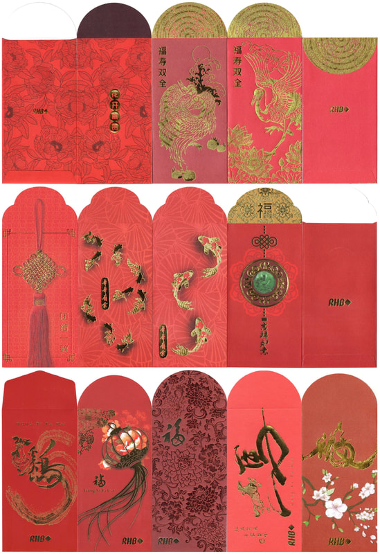
2013-2022 RHB
UOB carries on with their color themed packets and moved the zodiac from the front in 2020 to the inner flap in 2021. We saw the teardrop shaped mice followed by the tiny bull under the flap then, this year we are able to catch the (inner) tiger stripes and its tail and partial head up front. Do you remember which year their zodiac series started? We had the horizontal oinkers and doggies, the geometric roosters and monkeys, and finally the deer which may or may not truly represent the goat. What do you think?
Unfortunately I have not been able to collect their private version since 2020, the collection continuesヽ(ヅ)ノ
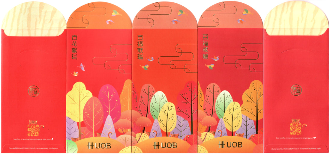
2022 UOB Mass Market / Commercial
2021 UOB Mass Market / Commercial
2020 UOB Commercial
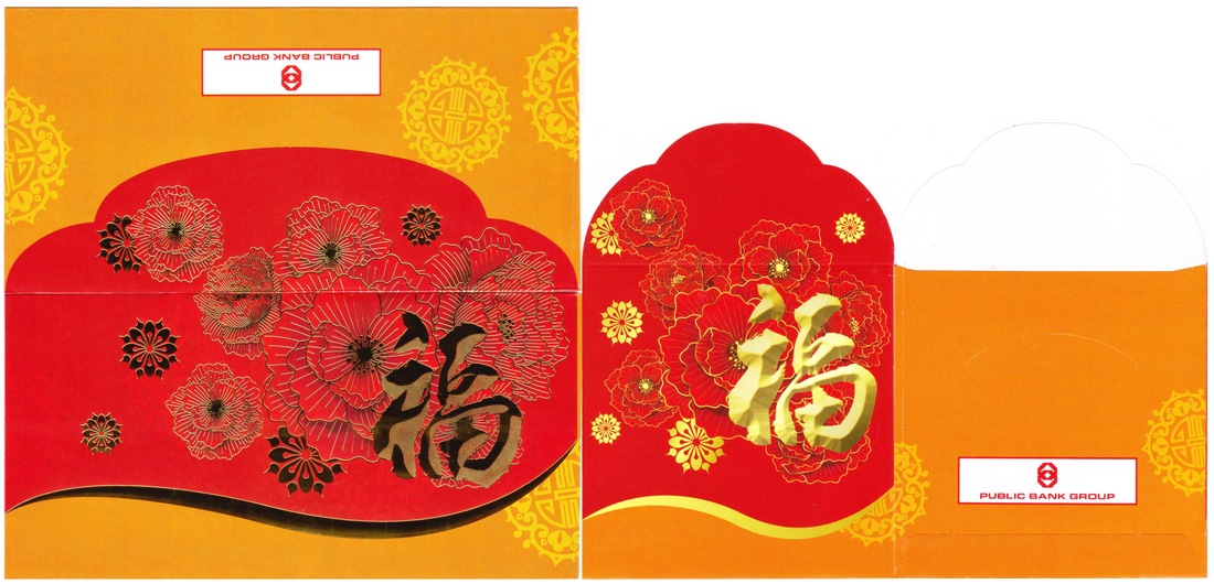
Next is Public Bank with their signature character Fu that collectors can play around with the presentation a little. I am still missing the normal long piece from 2021 but I am content with what I have. Hari Raya edition is in green with a little gold, consistent layout and flap then so let's see if they will have a similar theme for the coming Raya edition.
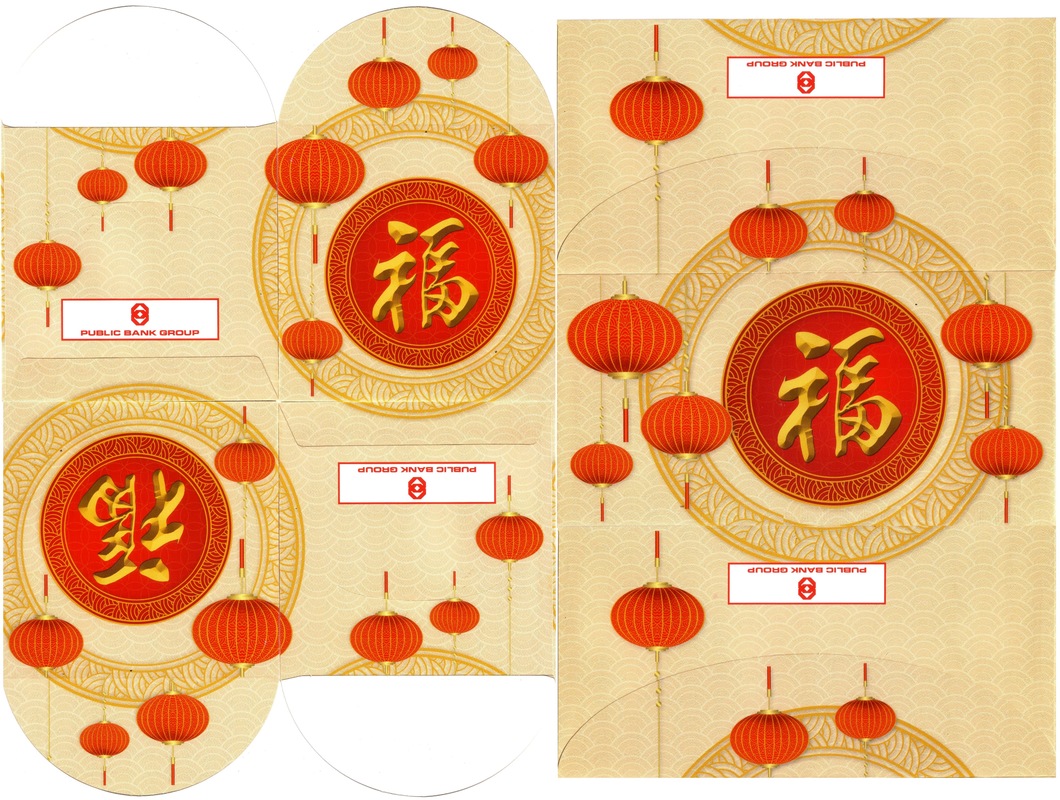
2022 Public Bank
2021 Public Bank
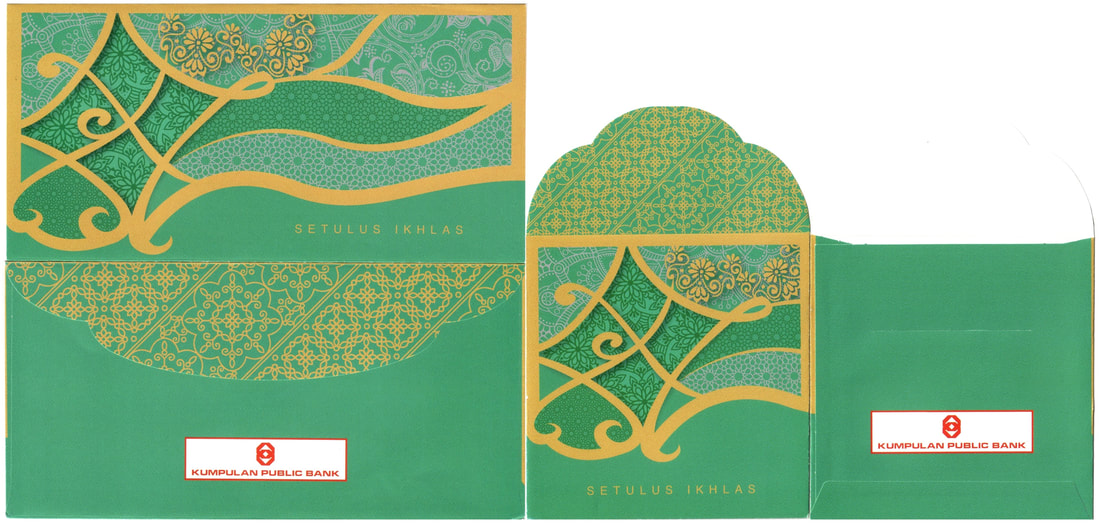
2021 Public Bank (SDR / Raya)
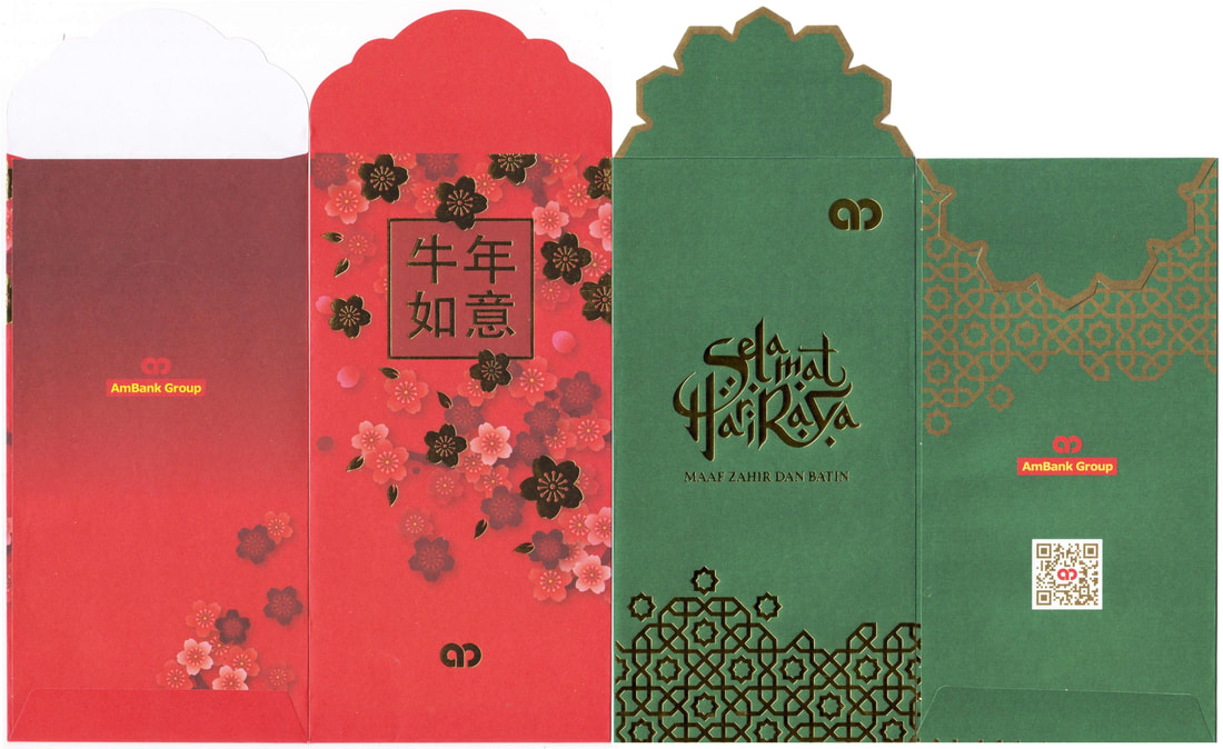
2021 Ambank (CNY / Raya)
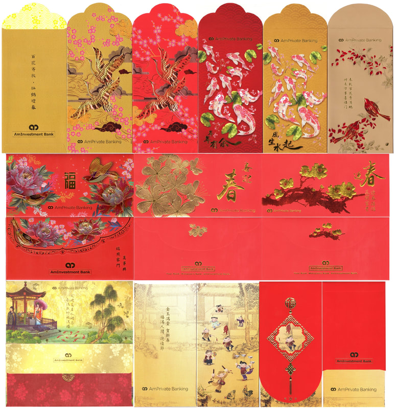
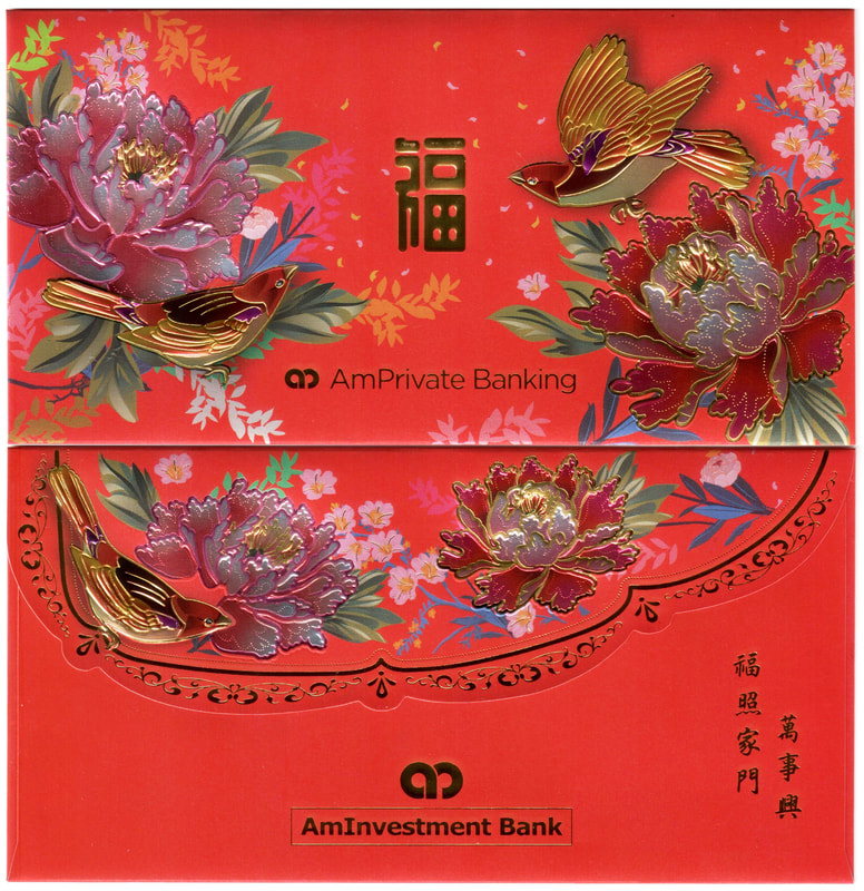
2015-2022 AmPrivate Banking
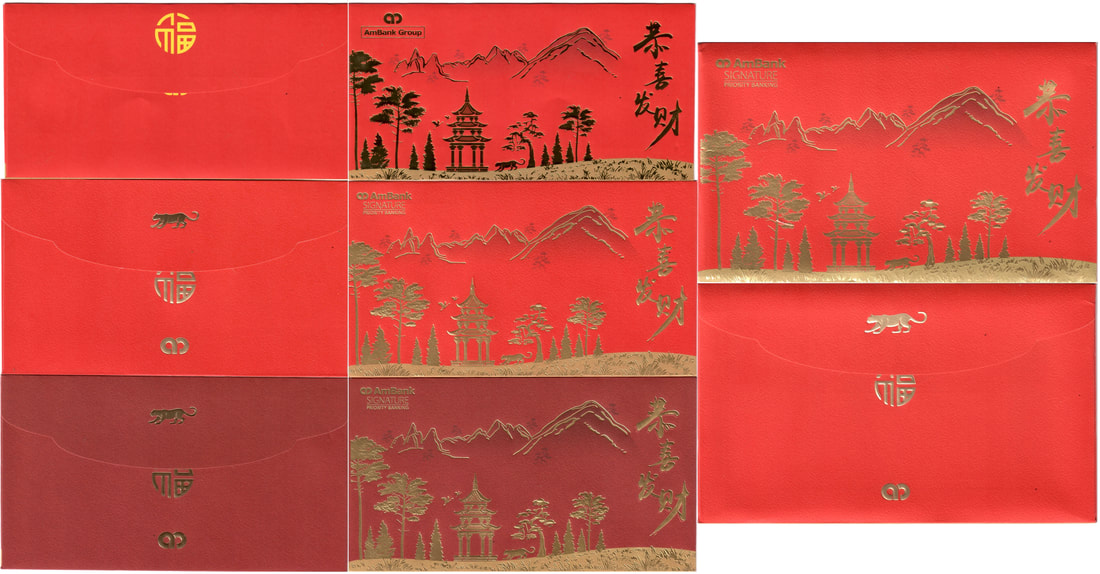
2022 Ambank Signature Priority Banking
2021 Ambank Signature Priority Banking
2020 Ambank Signature Priority Banking
AmBank once again caught my attention with my favorite floral theme for their Private Banking edition, the touch and feel is so satisfying for me. Thanks to Mei Fern for the chance to own the Private edition series over the years. They do tell tales, 2017 and 2018 are both my top picks, the traditional themed of children playing and that gorgeous fabric maiden!
They have continued to include the zodiac on the flap for the Signature series but went horizontal this year instead of their tall floral sets in the past. Do you remember their zodiac series since 2014? Check out my 2015-2018 (missing the horsey yes). 2019 was just a single design but marked the beginning of their floral journey, no zodiac because it was the year of boar (which is prohibited under the Muslim religion). Missing the rat? Click on the 2020 to find them.
2022 AmPrivate Banking
|
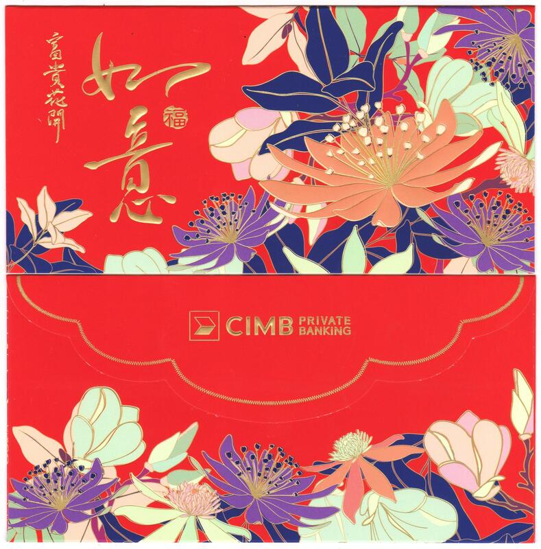
2022 CIMB Private
|
2021 CIMB Private
2019 CIMB Private
|
2020 CIMB Private
|
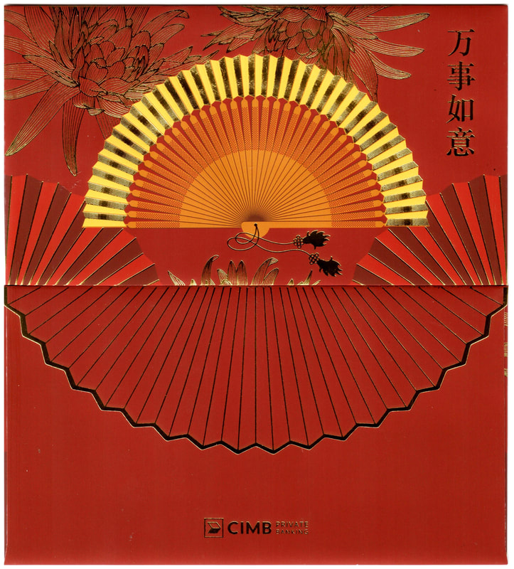
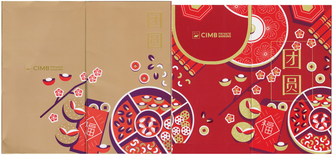
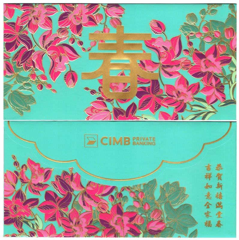
CIMB this year presented us the golden fan vs their last year CNY dishes and snacks. I am missing their floral series very much; Just look back at the purple perennials and pink blossoms, a true beauty, blooming lusciously among the other bankers. The normal, preferred and private comes in different sizes and layout vs last year's three tier cake form,
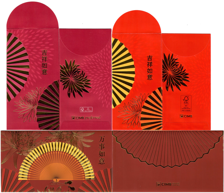
2022 CIMB Private vs Preferred vs Normal
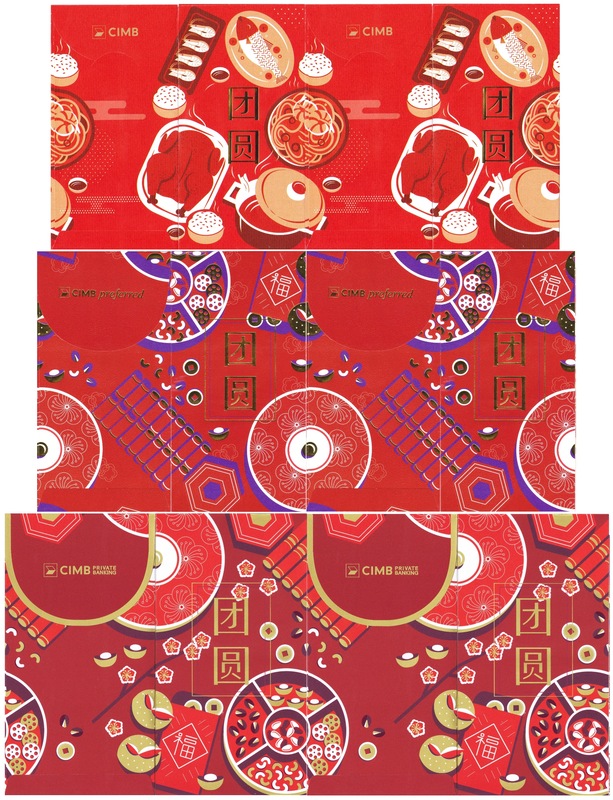
2021 CIMB Private vs Preferred vs Normal
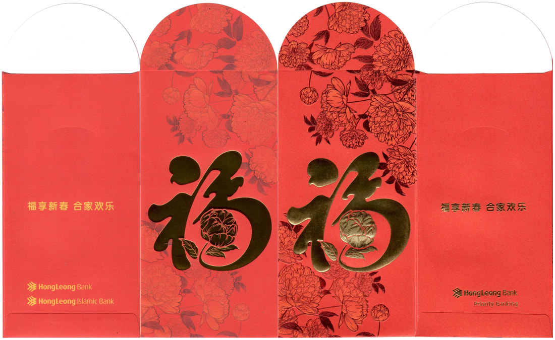
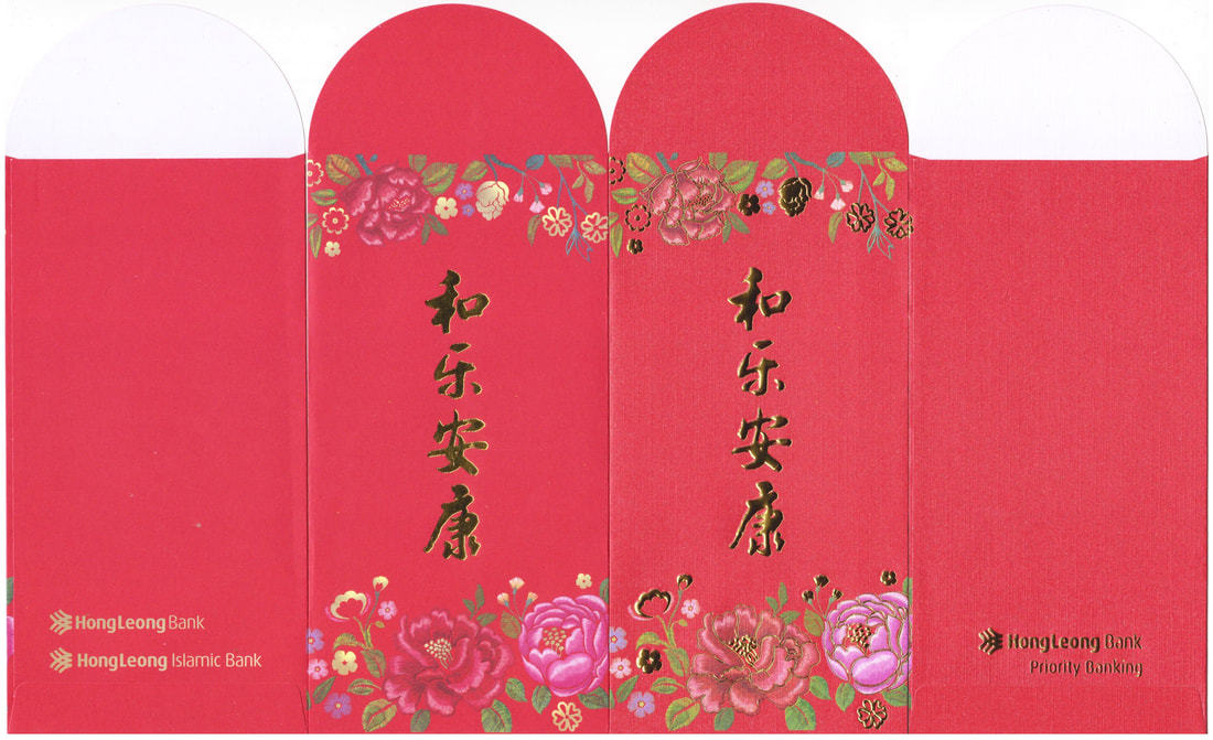
Hong Leong bank is still taking it simple like last year with a big golden Fu, both the same design for mass market and priority banking. Unlike previous years the difference are quite apparent with different paper and printing effect, 2021 only difference was the gold embossing while this year the paper for Priority is much better.
Alliance has grown tall, switching to portrait layout, their floral journey continues yet another year.
2022 Hong Leong Mass vs Priority
2021 Hong Leong Mass vs Priority
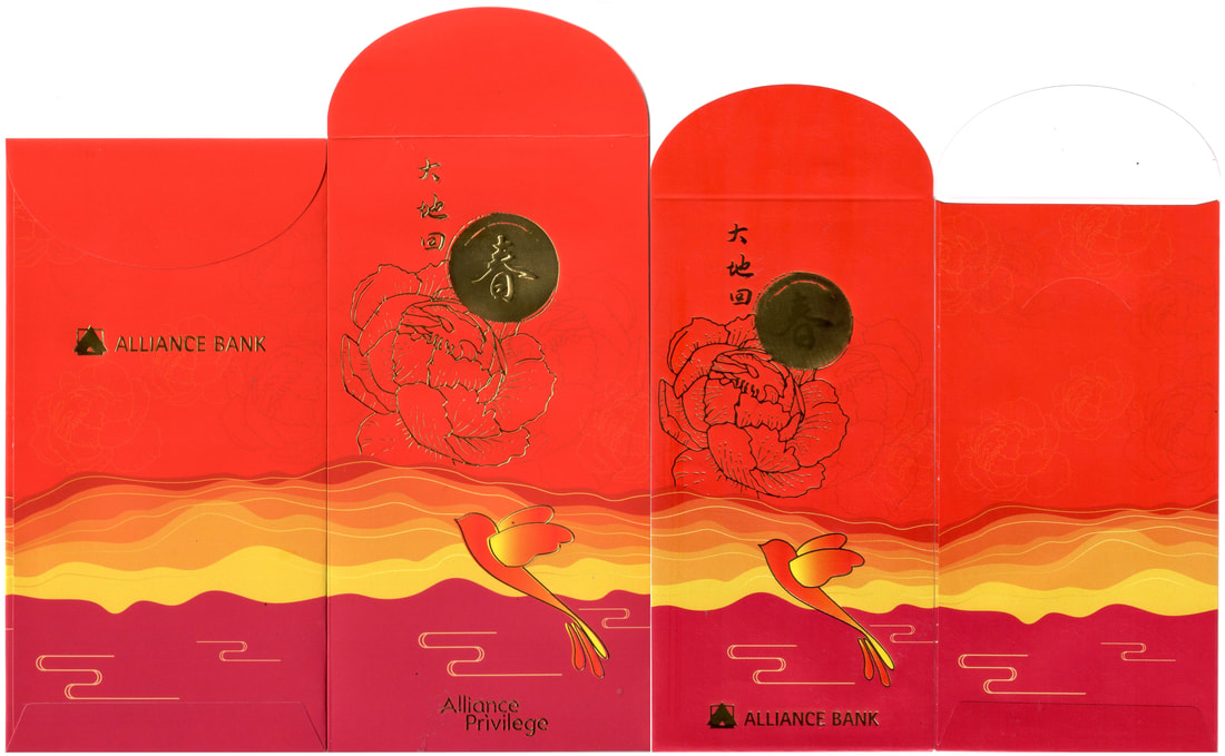
2022 Alliance Mass vs Privilege
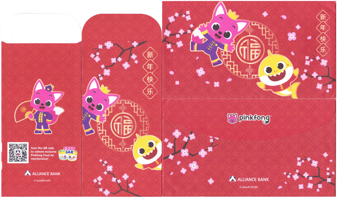
2021 Alliance PinkFong SmartStudy
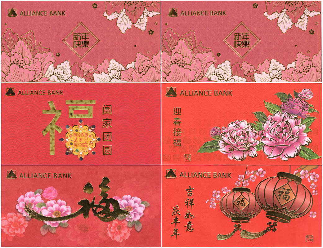
2017 - 2021 Alliance Mass Market
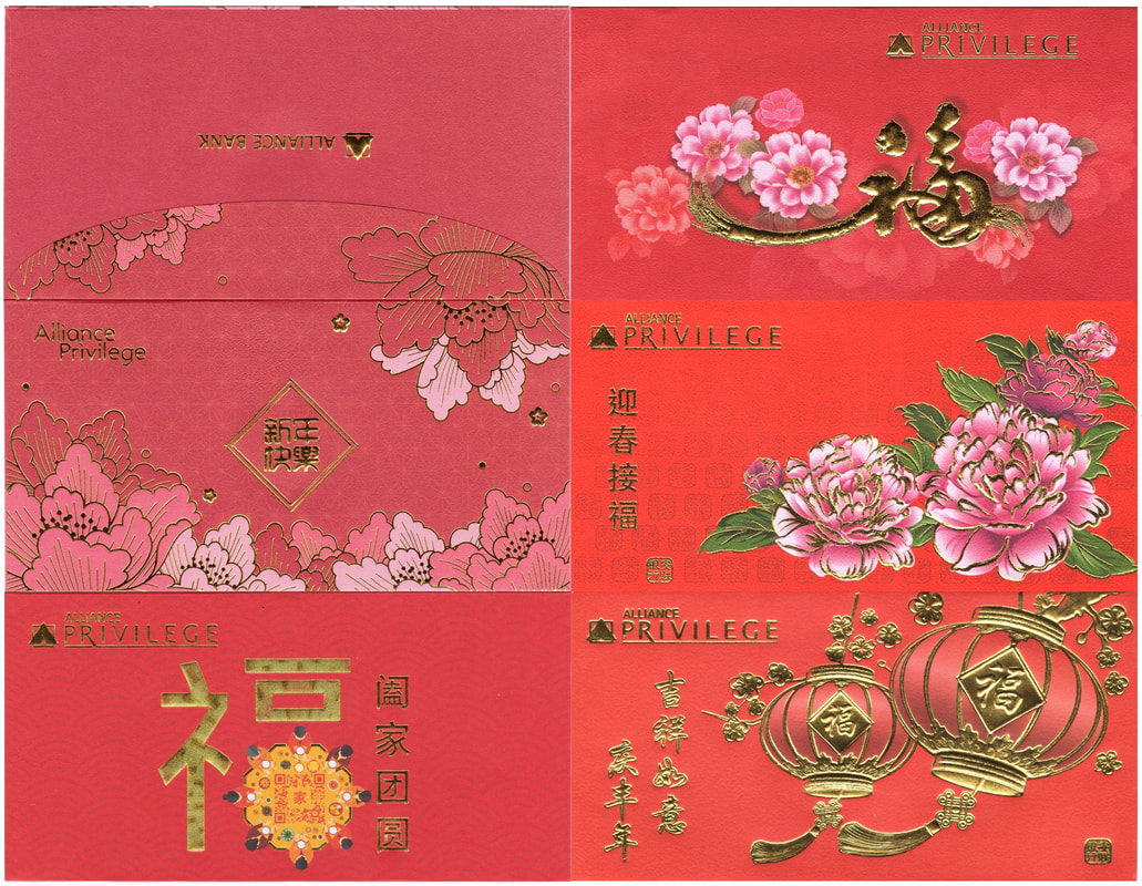
2017 - 2021 Alliance Privilege
Next up HSBC; The blue butterflies meet the birdies. Many couldn't tell that last year's design was actually a pair that came in two different shades of red, one is darker and the other lighter but the more easier differentiation would be the leafs on the reverse side (one is white line and the other is black). This year they have made it apparent with the red and orange shades.
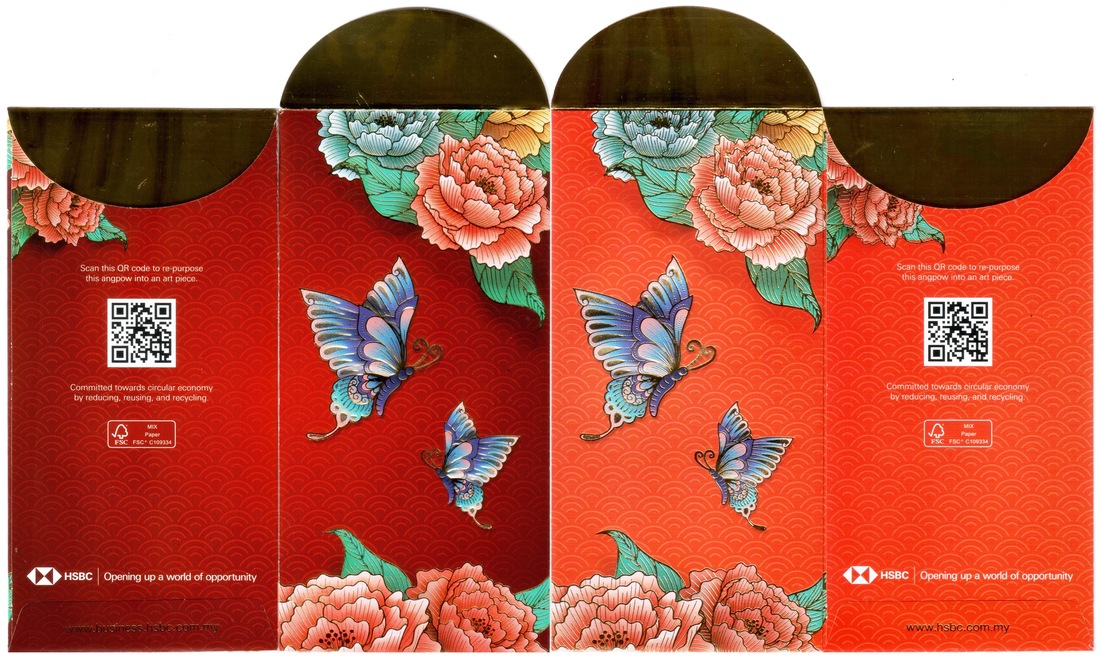
2022 HSBC Business
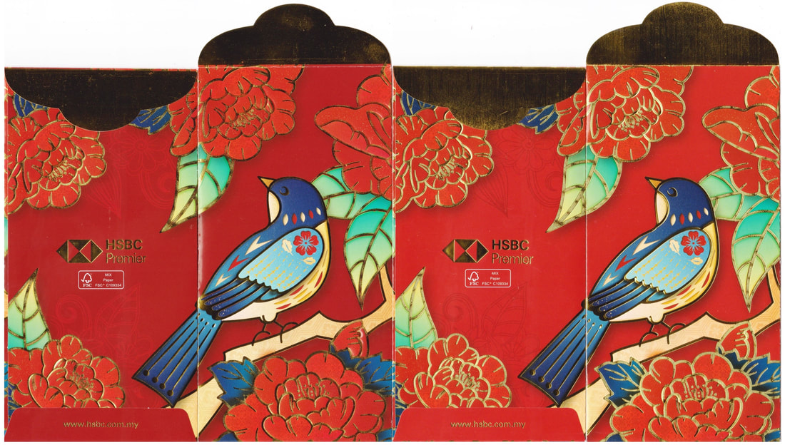
2021 HSBC Premier
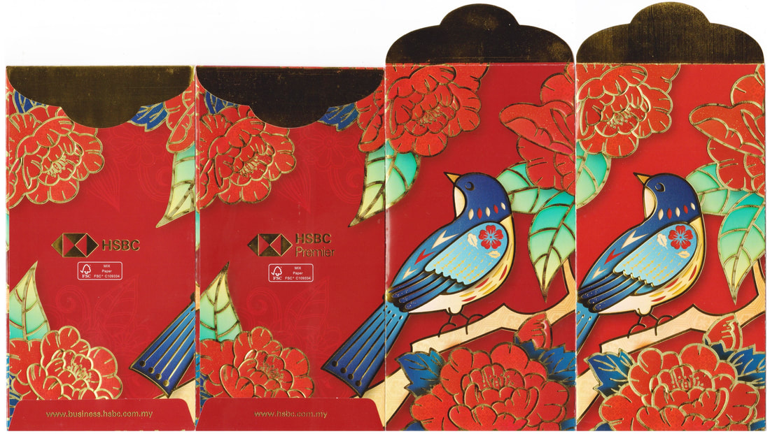
2021 HSBC Business vs Premier
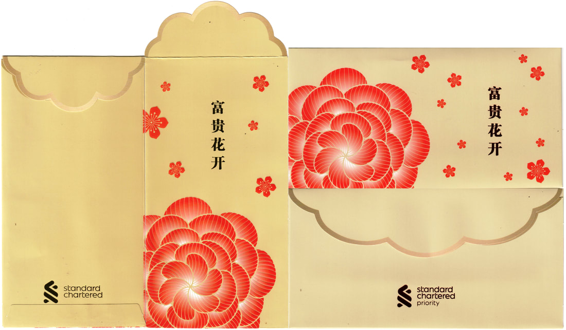
2022 Standard Chartered Priority
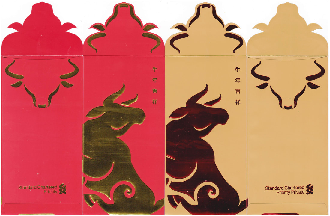
2021 Standard Chartered Priority Private
Standard Chartered is a little let down for me this year with a very simple floral illustration vs their golden and ruby bulls as well as the Liverpool Football Club set even though I had mix feelings with the jerseys but I guess they definitely qualify as a collector edition.
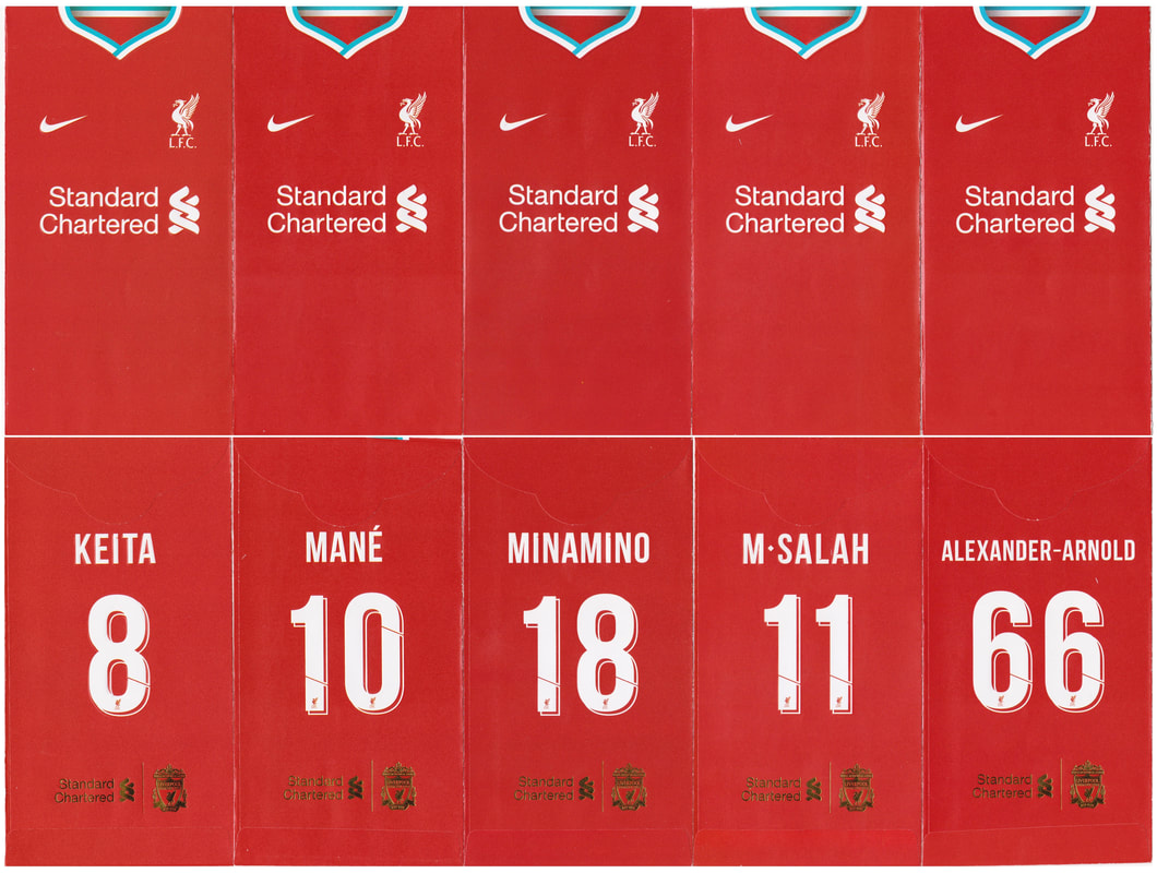
2021 Standard Chartered Liverpool Football Club
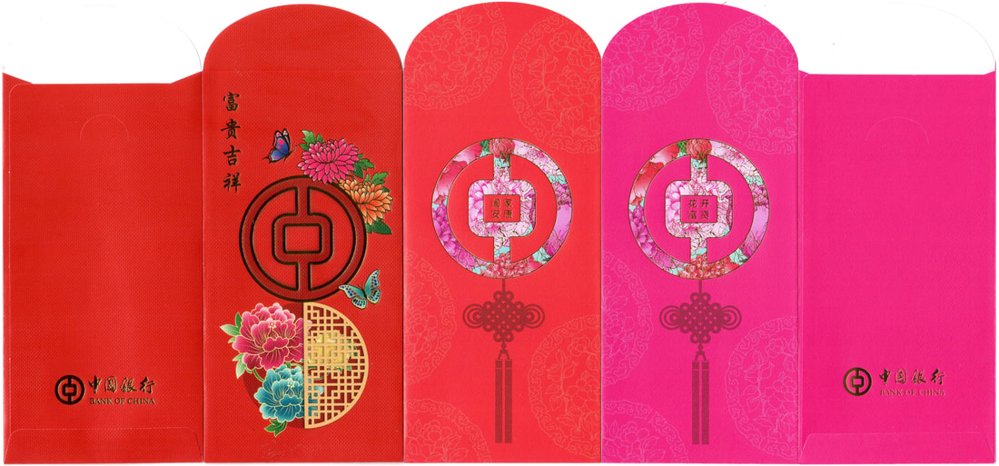
2021-2022 Bank Of China
We have Bank of China in a more sharper tone this year with fluttering butterflies vs the Chinese knot paired with a soft floral touch to highlight their logo last year.
Bangkok Bank has been changing their flap layouts since 2018. I do like the matching floral motifs from last year pink and this year red shades. Do you remember their 2014 design which was also used by another company? And there was another that took on a different design but from the same family series... here's the link ^^
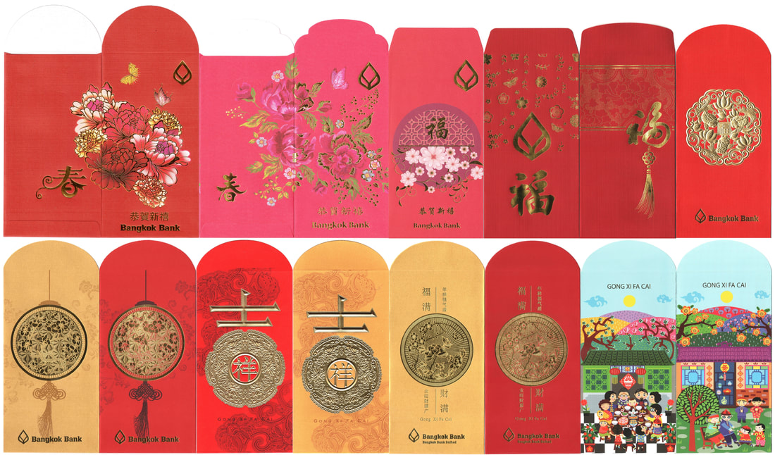
2013-2022 Bangkok Bank
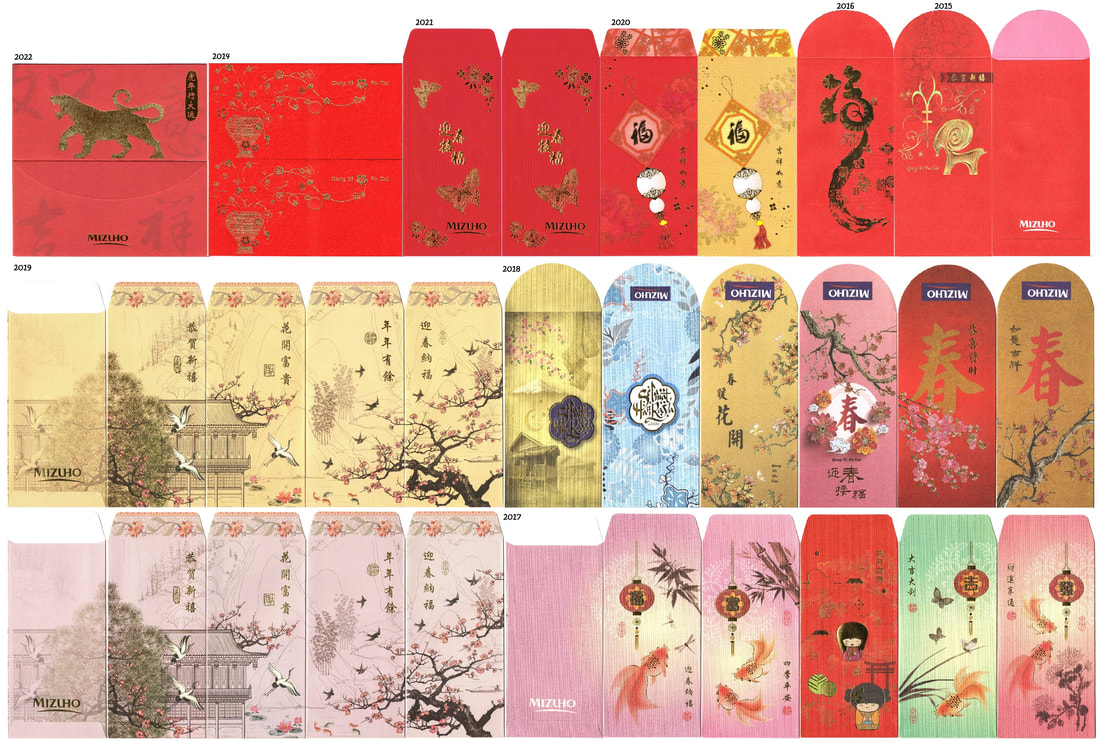
2014-2022 Mizuho
Mizuho second zodiac after the golden goat in 2015, the roaring tiger! They did cut back the colors as well as from pair to a single design since 2021. Nothing can match what they have given us back in 2019, another favorite of mine is their 2019/2018 2P.
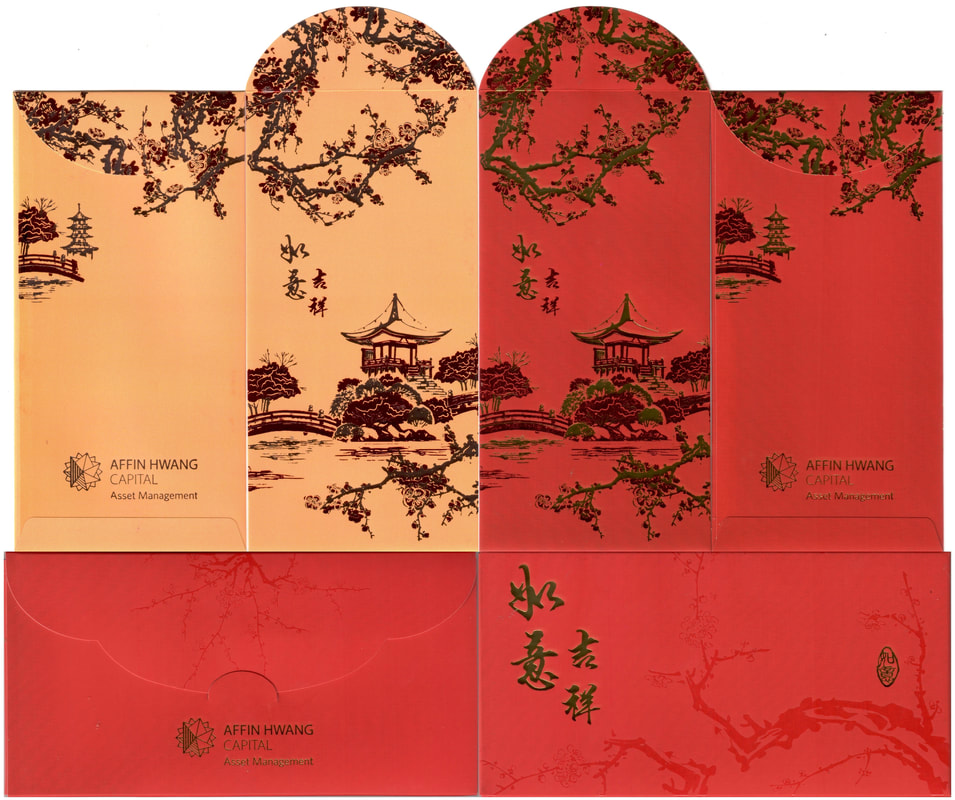
2022 Affin Hwang Capital Asset Management
Only caught Affin Hwang Capital Asset Management set this year and they are as elegant (with their signature red and yellow shades with gold and ruby hot-stamping) as before. Their 2021 horizontal layout (below) is similar to the 2019 design but instead of butterflies, they have chosen the golden birdie. Unfortunately I did not manage to complete their 2020 fish set, while the only other complete year in my collection is 2018.
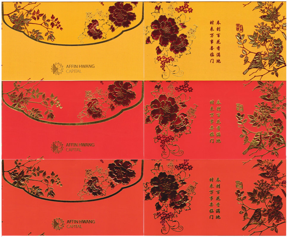
2021 Affin Hwang Capital
Kuwait Finance House took away the colors and revert back to the 2018 single red and gold design. 2021 had the flap carrying the ocean waves, while my favorite from them is their 2020 picturesque 山水画 (shān shuǐ huà), the breathtaking landscape painting!
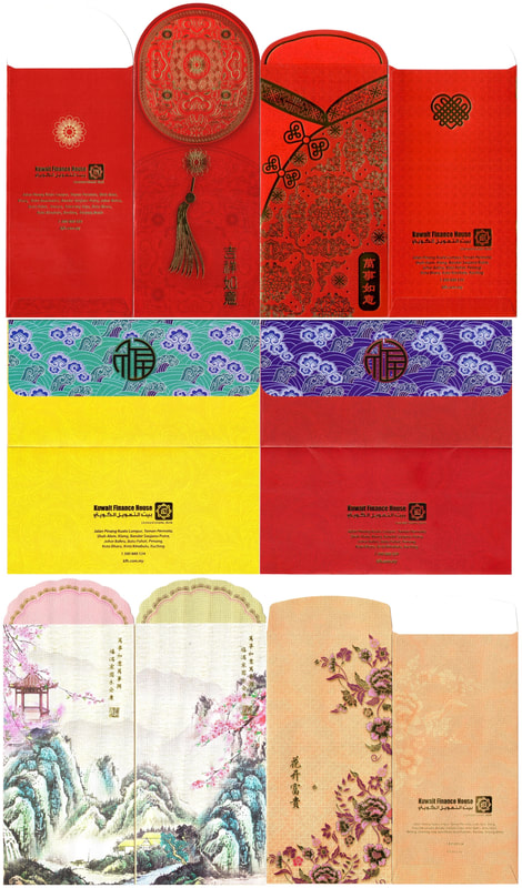
2018-2022 Kuwait Finance House
After a bullish year, FSMOne Fundsupermart is back with their second zodiac and it's quite a catchy one too with its roaring red tiger appearing within the Chinese character Hu 虎 (Tiger), with yet another change in their flap layout. Let's see if we will get a third (zodiac) and fourth (flap) in 2023.
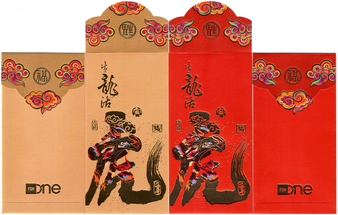
2022 FSMOne Fundsupermart
2021 FSM One Fundsupermart
2020 FSM One Fundsupermart
I N s u R a n c e ( 2 0 2 2 / 2 0 2 1 )
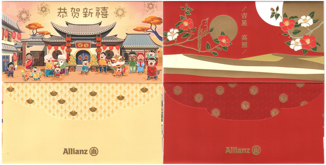
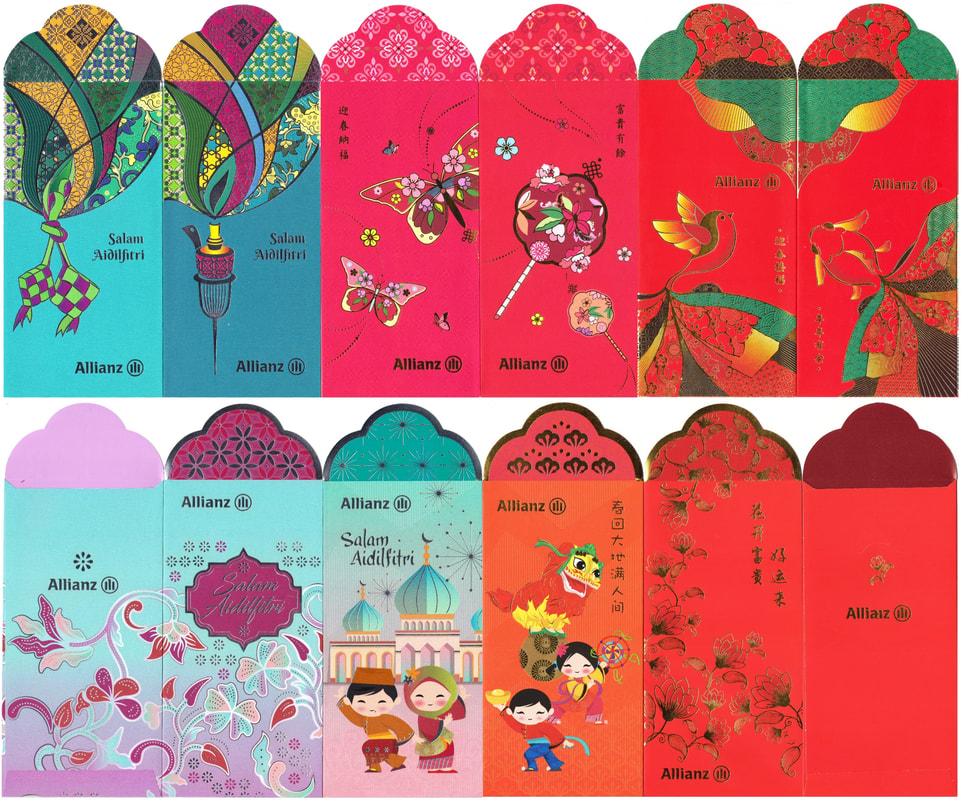
2022 Allianz
2019-2021 2P Allianz (CNY / Raya)
Allianz has taken a different direction this year, no longer standing tall they are now back with the horizontal layout. Do you remember that both 2018 & 2019 pairs then had one in landscape and the other in portrait? Follow the link to their previous 2P, all a favorite of mine especially with the felt floral: 2018, 2017, 2016.
My zodiac series from Tokio Marine Life is next, my favorite is still the origami pups in 2018.
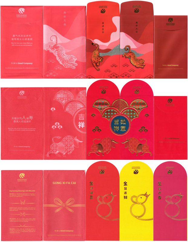
2020-2022 Tokio Marine Life
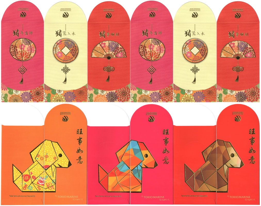
2018-2019 Tokio Marine Life Insurance
Here comes the colorful family from Great Eastern
This is their first year without the zodiac after 11 years and I am loving the lions!!
Take a look at their past year series below, a lot of changes they have ^ ^
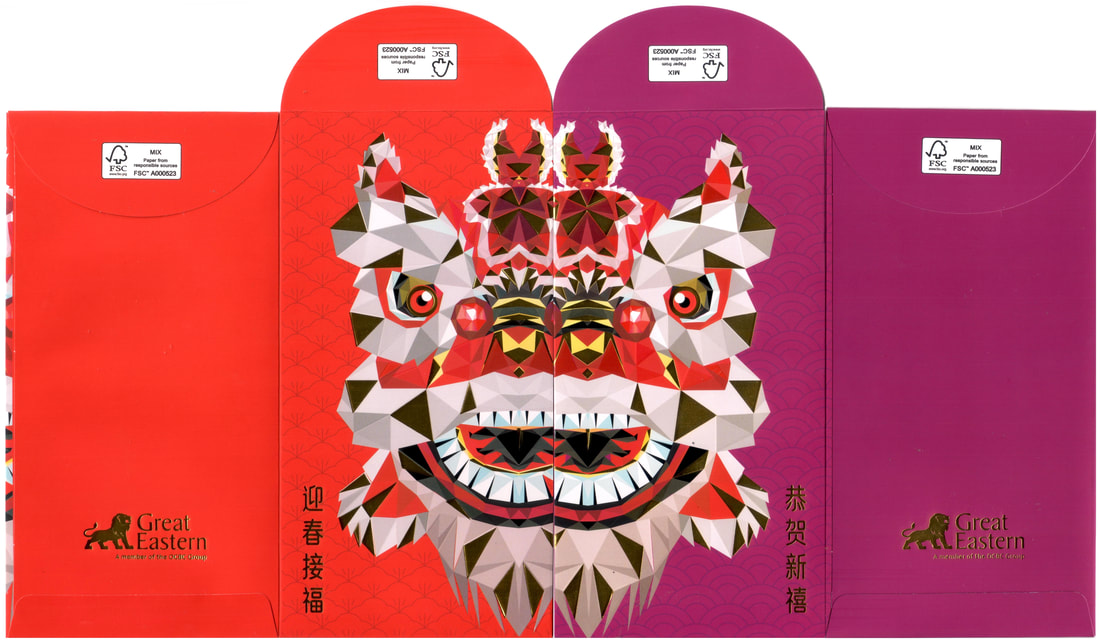
2022 Great Eastern
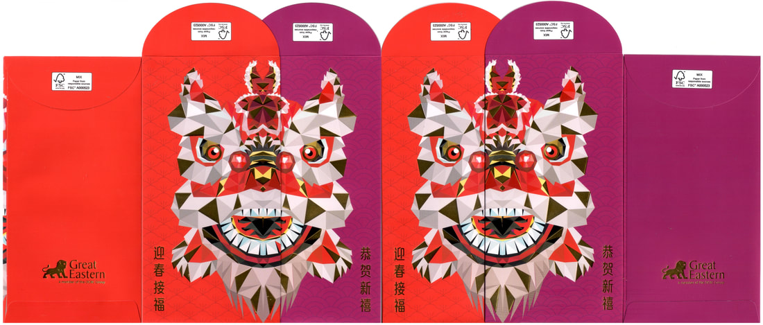
2022 Great Eastern (Overlap View)
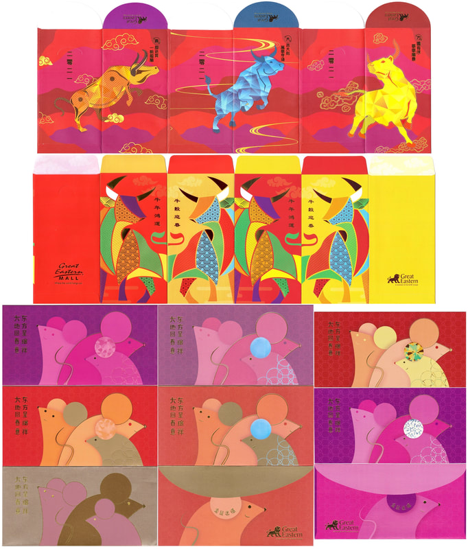
2020-2021 Great Eastern
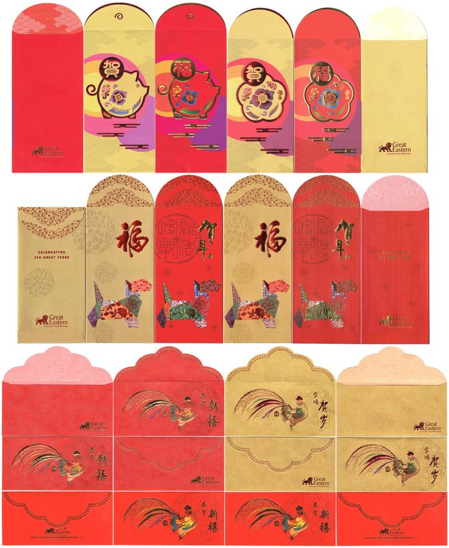
2017-2019 Great Eastern
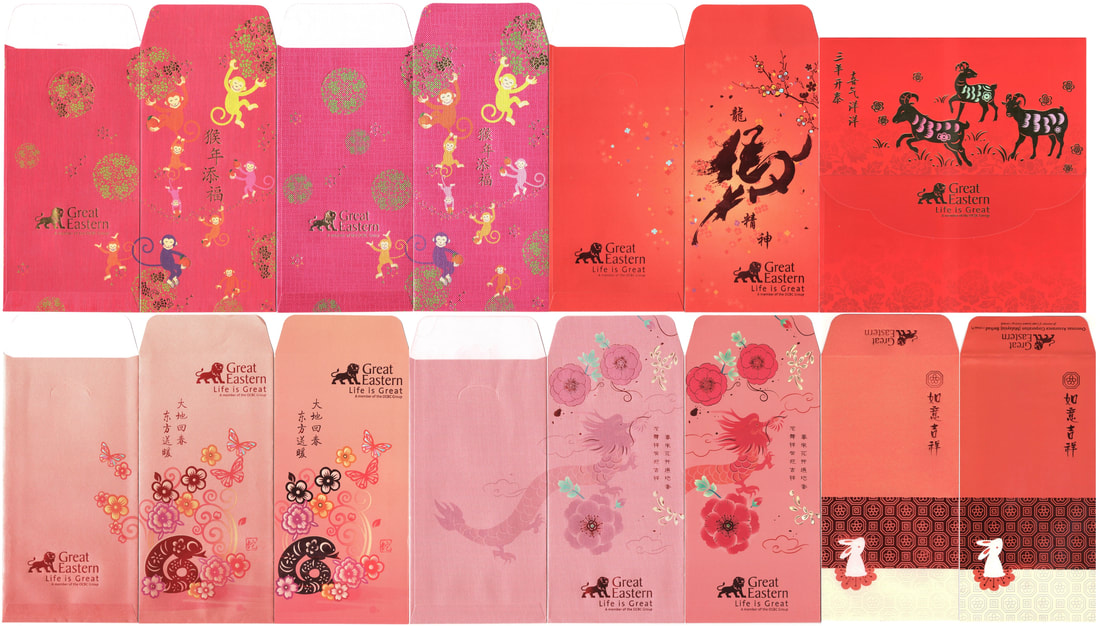
2011-2016 Great Eastern
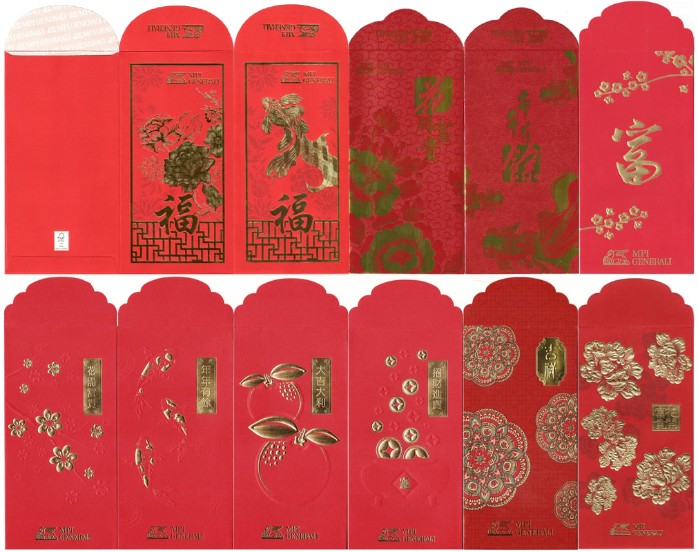
2017-2022 MPI Generali
After taking on a glossy floral and fish pair design last oxen year, MPI Generali went back to good old matte with another peony and gold fish illustration this round. Noticed the change in the flaps? I like it back then when they had a few years of consistent flap design, they looked much nicer.
2021-2022 AIA General
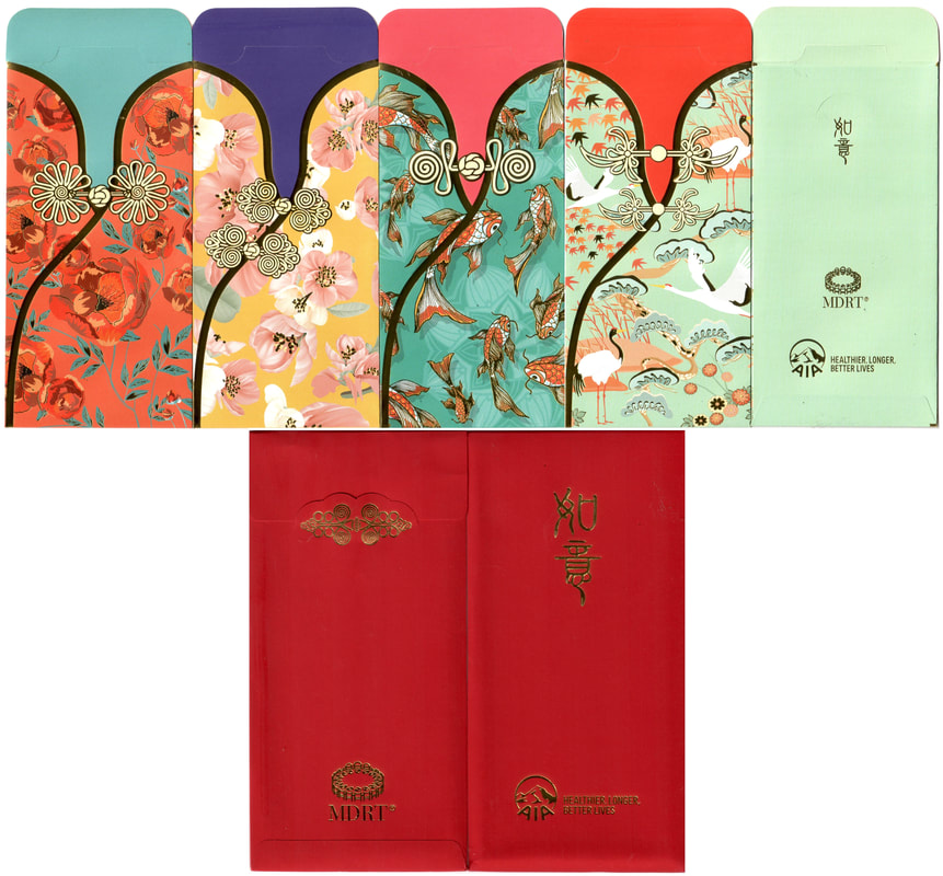
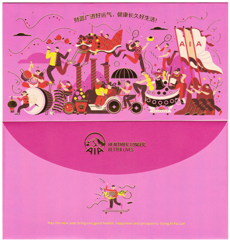
AIA family
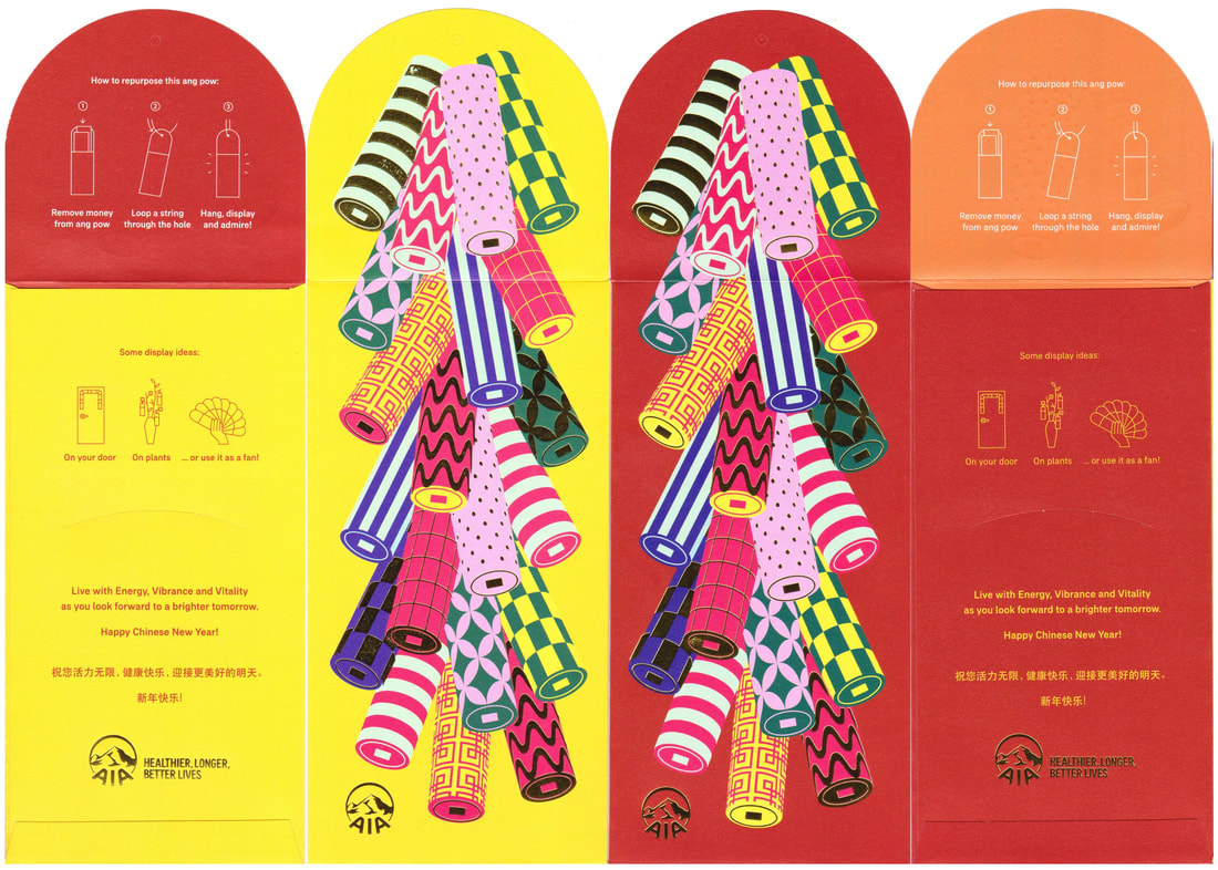
AIA family is getting bigger by the year with the additional General, Million Dollar and MDRT edition since 2021. This year we have their Million Dollar set of four taking the spot light while last year their MDRT cheongsam set captured many collectors' heart. The normal edition even though just a single piece delivered a little something fresh with lion dancing upfront and a big family within, Last year firecrackers arrived with a bang in pairs while the year before the single pink piece was the simplest due to the pandemic. Do check out their 3P from the past, they were such meaningful series ( 2019, 2018, 2017, 2016, 2015 )
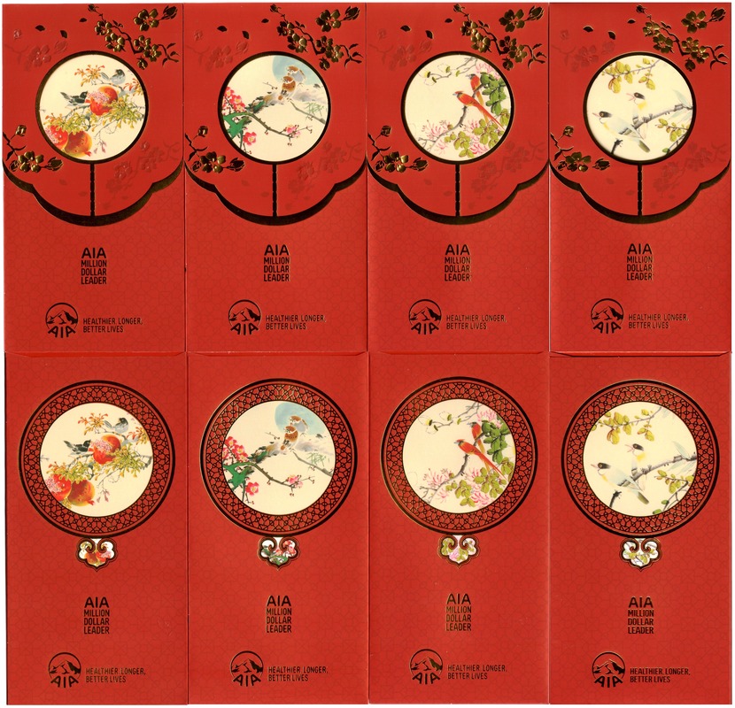
2022 AIA Million Dollar Leader
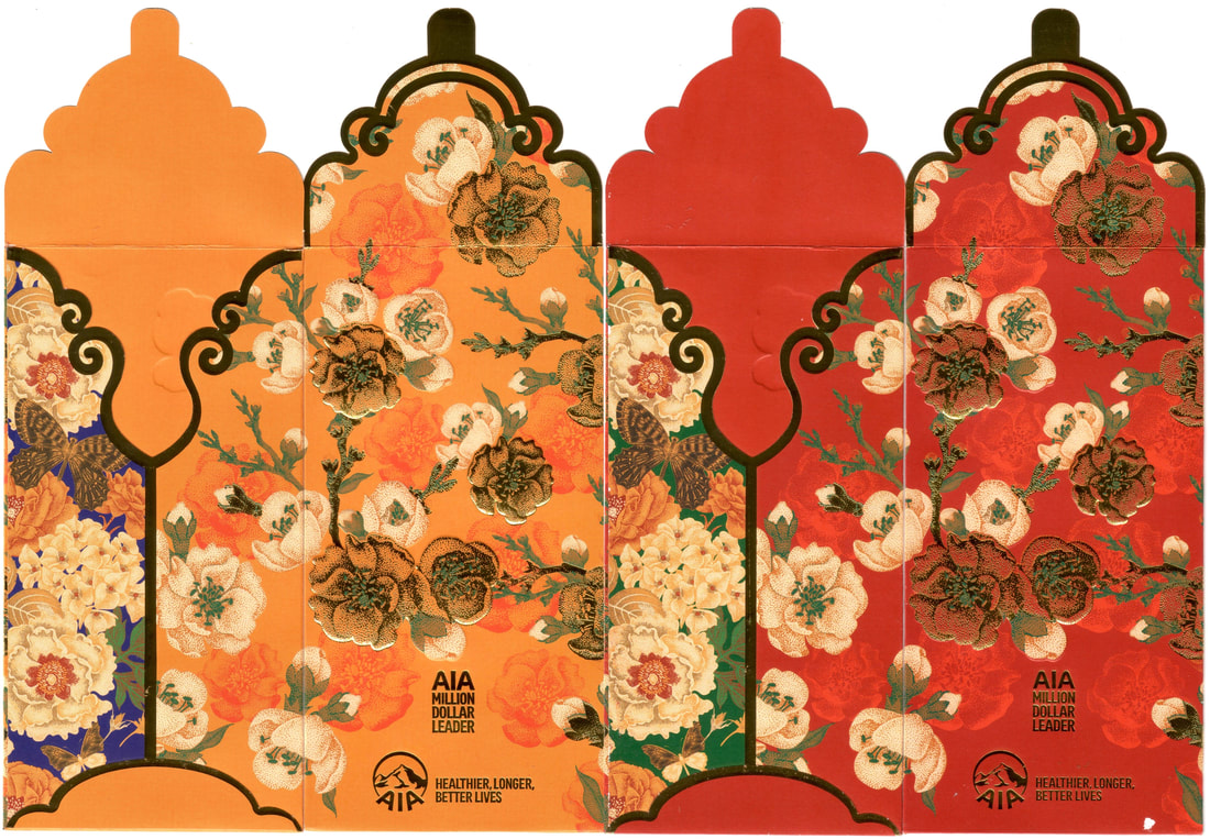
2021 AIA Million Dollar Leader
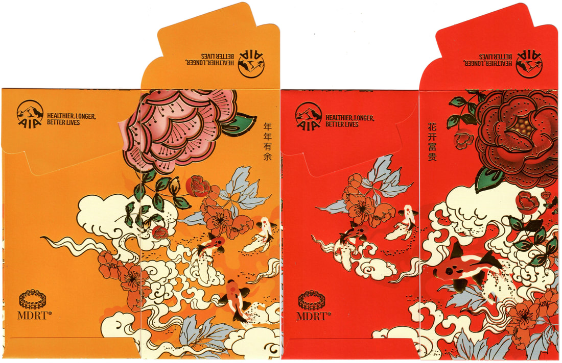
2022 AIA MDRT
2021 AIA MDRT
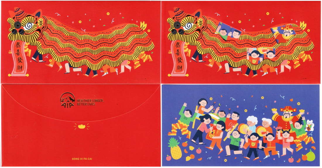
2022 AIA
2021 AIA
2021 AIA ( SDR / Raya )
2020 AIA
|
2020 AIA MDRT
|
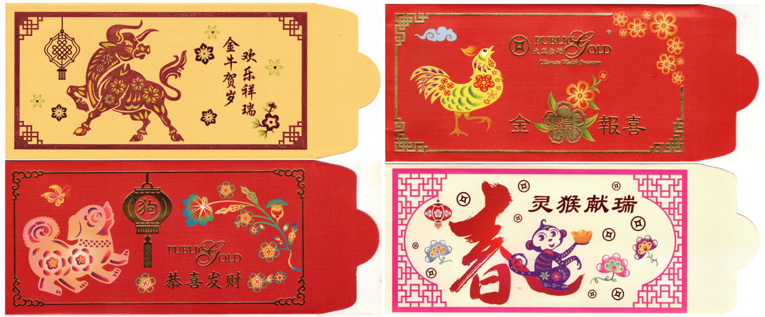
2016-2018 2021 PB Group Public Gold PGMall PG Jewel
For more of my latest collection, please visit my facebook page or get the links to my collection by years via my facebook album here. (๑‵●‿●‵๑)
View the complete red packet albums in facebook by years:
2021 (MY), 2021 (SG), 2020 (MY), 2020 (SG), 2019 (SG), 2019 (MY), 2018 (MY), 2018 (SG),
2017 (MY) , 2017 (SG), 2016 (MY), 2016 (SG), 2015 (MY), 2015 (SG), 2015/2016 (HK),
2014, 2013, 2012, 2011, 2010, 2009, 2008, 2007, 2006, 2005, 2000-2004, 1990s
2021 (MY), 2021 (SG), 2020 (MY), 2020 (SG), 2019 (SG), 2019 (MY), 2018 (MY), 2018 (SG),
2017 (MY) , 2017 (SG), 2016 (MY), 2016 (SG), 2015 (MY), 2015 (SG), 2015/2016 (HK),
2014, 2013, 2012, 2011, 2010, 2009, 2008, 2007, 2006, 2005, 2000-2004, 1990s
